These are often the order that the credits will run by.
- Name of studio
- Name of production company
- Producer name
- Staring (starting with the main actors)
- Featuring (featured actors)
- Casting director
- Composer of music
- production designer
- Editor
- Director of photography
- Producer
- Writers
- Director
we plan to take on board and incorporate how the order of credits are presented. We have decided as a group to follow these conventions and adhere to how other producers have ordered the credits in their film.
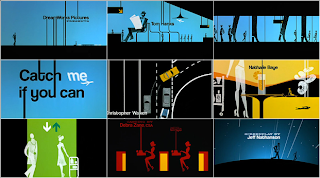
Catch me if you can
- Titles are integrated into sequence (become part of the action)
- Exit screen smoothly looks elegant and could resemble the character who plays the police officer.
- Typography looks stylised and works in sync with music.
- High production value
Font is sans serif - 60's styled which hints time era of film/setting
- Informal font suggests film wont have a consistent serious tone and elements of humour could be present.
- Smaller words are serif which resembles an old typewriter which again references the 60's and suggests significance of the object in the film.

No comments:
Post a Comment