Tuesday 16 April 2013
Evaluation
In what ways does your media product use, develop or challenge forms and conventions of real media products?
Monday 25 February 2013
Monday 11 February 2013
30th January 2013, journal
30th January 2013
These are some pictures of the surrounding and location that filmed part of our title sequence on the 30th January. WE filmed several shots of the fantastagirls coming together as one, individual shots for emphasis of power., shots of us walking and leaving the house. We filmed the fantastagirls outside in a really lovely location with the weather looking bright and warm, this location enabled us to come in from four different directions and meet in the middle. We did have some difficulties because it was very windy and at one point the camera fell over. Sometimes one of us walked slower than others so we had to shoot more than once on some. After this happening, we put weights down on the camera so this did not happen again. We also got many shots of us as we wanted to choose from a variety of angles. We were very happy with the shot of all of us walking together. We also got a closer shot of all of us together, where we wished the title 'The Fantastagirls' to appear. The shot was also from a low angle which portrayed us better superheroes because we looked a lot more superior to our other shots. We also got individual shots of us, as in our previous ideas we didn't have any and doing this made it look much better. Over all we were very happy with the whole filming and we were all very pleased with the total out come. We will need to look over our footage and then choose which ones will fit most appropriately in the title sequence.
I was really impressed with the progress we made today. We went to abbey ruins to film the last scene were we all come together as a group. We had some trouble keeping the tripod up as it was very windy and kept making it fall over. However we managed to get all the shots we wanted. We changed some shots that were in there as we feel they wasn't needed. We also had trouble as it turned dark whilst we were shooting so we changed the lighting and are hoping we can put an effect on it tomorrow


Tuesday 5 February 2013
Storyboarding
Storyboards
This is the story boards for our title sequence. This was the second story board we produced for our title sequence. Our first one completely failed because when we filmed the shots on the first draft, we noticed that the target audience for this film was not met. Also, the gender was not clear it was girl superhero.


This is the story boards for our title sequence. This was the second story board we produced for our title sequence. Our first one completely failed because when we filmed the shots on the first draft, we noticed that the target audience for this film was not met. Also, the gender was not clear it was girl superhero.


Typography for the credits


These are some fonts that my group looked at for our title sequence. We thought it seemed appropriate to use any of these typography as it fits the codes and conventions for a superhero film. However, they do associate with superheroes, we thought that the typography we found looked too masculine for a little girls film. We thought it would be better to use the title typography as its more girl and it shows off the typography font more.
Thursday 31 January 2013


Change of Music
Music
As we have recently as a group decided that our original title sequence failed to adhere to the target audience, we had to scrap that idea and change our whole title sequence setting. As we had changed the whole title sequence this means we had to change the idea of our music choice to fit in with our target audience.
The music song choice is now more upbeat and 'girly'. This shows we have adhered to our gender audience, which was aimed at young girls. We used the same website as before as we wanted to avoid copywright in any form. We came to the final two decisions for a song choice that best suits the title sequence we have refilmed.
Credits

These are the final credits we have decided to have on our title sequence. We did not change the typography as we thought it would be better to keep the same typography throughout the whole title sequence. This shows our film is primary aimed at children. These are the actual film members involved in our film 'The Fantastagirls'.
Tuesday 29 January 2013
Typography
This is the typography me and my group have decided for the credits to appear. The reason for this particular typography is because we thought that it would be best to keep the same typography to the title of our film so that it could show off the typography. We done this to create a signature brand that everyone will remember.


Thursday 17th January 2013, Journal
On Thursday 17th January, we filmed in Danson park. We filmed a lot of shots within the time we had. We filmed during school hours; we had about two in hours to get as many possible shots in. We filmed people reading newspapers about the fantastagirls and we also filmed the shot of the fantastagirls altogether. We were very happy with the outcome of the filming as we got many successful shots and we are very pleased with them. However if we were to do this again we would have filmed more shots, in different angles to give it a better effect. Also, it would have enabled us to have a better variety of the shots that we took. We were very lucky with the weather, as it was very sunny and the reflection of the sun on the lake looked very picturesque and this created a sense of optimism. I think that it would have also been better if we were more prepared for the shooting, as we would have maybe been able to get more done in the time available.
After the shooting and we arrived back to school to continue to finish the sequence and start editing, we came across some errors within the shooting. For instance, when we uploaded the shots in final cut we noticed the sun pictures in Danson were not as successful as we thought as we could not see our faces in the shot. This had major impact on our filming as it did not look like a girl gender superhero film.
After the shooting and we arrived back to school to continue to finish the sequence and start editing, we came across some errors within the shooting. For instance, when we uploaded the shots in final cut we noticed the sun pictures in Danson were not as successful as we thought as we could not see our faces in the shot. This had major impact on our filming as it did not look like a girl gender superhero film.


Screenshots of us filming


This is a shot of how the editing that we shot on the 28th January for our title sequence is coming along.
Thursday 17 January 2013
15th January 2013
15th January 2013
Today we filmed a few shots on Zorack's dad that has just saved the day and was being asked by reporters to explain how he saved the day. We filmed this shot several times in three different angles to see which came out better. After we shot Zorack from a distance, watching his dad outcast him from everyone. We filmed Zorack angerly dropping his toy in devistation that his dad forgot about him.
In todays filming we had trouble getting an audience to film the shot of Zorack's dad as everyone was either in lesson or revising. We manage to get a dozen on the shot to film. The disadvantages to this was the viewing into whether it looked realistic or did not. To overcome this disadvantage we could of picked a better time to film to make the shot look realistic.
Sunday 13 January 2013
The Fantastagirls Logo
The logo for 'The Fantastagirls' as shown below, also mirrors the girls themselves. The stars giving connotations of girls, but also, creating a super hero type feel to it too.


Budgeting, pitch idea
The Budget for our film is £35,000,000 and we have estimated a profit of £80,000,000. We have researched in a film similar to ours 'Sky High' and we have estimated the budget and profit around this film.
Because the film is targeted for a younger audience we can produce merchandise out of it which can also be a benefit in the profit.
Underlying messages within the film:
- friendship, the disruption of loneliness; the impact family has; and jealousy.
Our primary target audience is for the film is for girls up to the ages of 13. We also think that the film can be targeted at family audiences too.
The release date of our film is going to be in August 2013, this is because it will be in the summer holidays and it will be more suitable for children to see it.
The Director of the film is Mike Mitchell because he has previously made films that are similar to ours. For example: Sky High (super heroes), Shrek (younger audience)
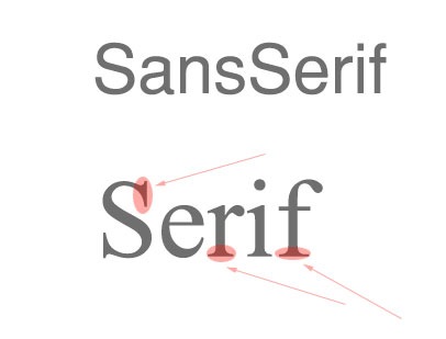
Type of typographys
The two types of typography are: Serif and San Serif
Serifs are the small lines tailing from the edges of letters and symbols
San Serif or simply sans typeface is one that does not have the small projecting features called "serifs" at the end of strokes.
Below show the examples:
Serifs are the small lines tailing from the edges of letters and symbols
San Serif or simply sans typeface is one that does not have the small projecting features called "serifs" at the end of strokes.
Below show the examples:
10th January 2013, Journal
10th January
Today we filmed furthermore shots. Today we found out that the deadline was arriving sooner than we imagined so we had to come up with a quick way of getting more shots done. We knew our original plan that we put on our story boards was not going to be the same as what we was going to film but we kept it similar by slightly changing our location from the story boards as we found some shots or choices off scenery were not right to film in. When we looked into filming in a park, we needed to be filming an over the shoulder sot of four people holing newspapers of the fantastagirls; when it came to realistic thinking all park benches was on grass so the footage would be jumpy if we used the dolly to pan it along. We changed our minds and asked around for four smartly dressed sixth formers to participate in our filming, we explained to them if they did not feel comfortable when we as filming they had the right to withdraw (the ethical issues). We experimented both using the dolly, tripod and camera to pan across left to right then right to left. We found that it was much clearer to see the newspapers it we did it reverse order (right to left). We also had trouble filming with one of our shots that was suppose to have a person walking down the street with a phone to show the mobile app which revealed more details for the fantastagirls, but the over the shoulder shot did not show the app well. We had trouble filming this shot as we needed to have the camera literally millimetres away from the actor so we could see what was appearing on the screen but we had trouble with getting the dolly caught on the actors foot. So instead we have changed it to a person in a office, however it is still an over the shoulder shot so we kept some the same.
7th January 2013, journal
7th January
We decided as a group to get one of the shots in our title sequence done today as we could not film anything else as we did not have the resources we needed to film. So we decided to go out in the morning and film by Bexelyheath train station. We had some trouble as people kept getting in the shots and we had to make the newspaper look realistic. It took us about an hour and a half to film, but we managed to find a free newspaper stand where it was legal to film, which we then put our own into.
The shots came out very successful, however our original plan was to use a better quality camera to shoot our footage with so that way it would look more realistic but we unfortunately did not have a camera that filmed so we had to use a flip camera. We was unprepared for our shooting as we did not organize it until we arrived in school. This was our first time filming and we left it until the last minute to organize our first shooting which resulted us to use a flip camera. Although we was unprepared we pulled through as a team and filmed some good shots to add into our title sequence.
Role within the group
There was four parts to decide who was who
- cinematography
- directing
- design and props
- location and makeup
With all agreed decision making, we put forward our reasons why we would like to be the part we nominated ourselves for. After the team decision making i was assigned the role i wanted to be as when we shot before in our previous year my cinematography skills helped me acheive a high grade; i was given the role the team thought i would be good at so i therefore was assigned the cinematography task. So far we have shot three different scenarios that are in our title sequence.
Holly was assigned to do design and props as she was constantly putting forward her ideas to do with costumes for each characters before we started thinking about roles within the group. From this Holly now had to design and prop. So far she has created props for the title sequence and the cast list is pending. So far we have made a sequel of when and where we are filming. Props: Camera Tripod Newspapers Dolly Magazine Ipad.
Hayley was assigned to be the directing manager of the group. The reason for this is because she is the one to get things done and dusted first within the group. Hayley nominated herself to be directing manager, we gave her the role to be organised and last final decision making say.
Megan was assigned location and makeup design as she believed she would be best to do the location and she is more prepared within the group to get organised where to meet and times. The makeup was just a new skills we thought she might be good at so we let her have the role into making our title sequence successful.
Order of credits
These are often the order that the credits will run by.
- Name of studio
- Name of production company
- Producer name
- Staring (starting with the main actors)
- Featuring (featured actors)
- Casting director
- Composer of music
- production designer
- Editor
- Director of photography
- Producer
- Writers
- Director
we plan to take on board and incorporate how the order of credits are presented. We have decided as a group to follow these conventions and adhere to how other producers have ordered the credits in their film.

- Titles are integrated into sequence (become part of the action)
- Exit screen smoothly looks elegant and could resemble the character who plays the police officer.
- Typography looks stylised and works in sync with music.
- High production value
Font is sans serif - 60's styled which hints time era of film/setting
- Informal font suggests film wont have a consistent serious tone and elements of humour could be present.
- Smaller words are serif which resembles an old typewriter which again references the 60's and suggests significance of the object in the film.
Newpaper prop

One of the props used in our title sequence is an open page view of a newspaper containing some of the exciting courageous battles that The Fantastagirls fought. Throughout the title sequence we have many people looking at newspapers about the fantastagirls. This is to show their individuality and later on we have a newspaper of the girls together. This again look better when blown up to A3. Each superwoman has a different section of the newspaper. This shows them fighting their own crimes individually before they are joined as one.
Props


This is our first newspaper front page. We attempted to make them as realistic as we could. They looked like a real newspaper when they was printed out and blow up to A3 size just more pale. This example of the newspaper of all the girls together which we plan to incorporate in our title sequence once we shoot everything. This hints our story line as it shows them together in this but separate in the others that we have created.
Saul Bass Title Sequence Analysis
Saul Bass Title Sequence Analysis
Seconds (1966)
To begin the title sequence, there is an extreme close up shot of an eye, we see the eye looking around creating a sense of panic; the eye is then hidden reinforcing the sense of panic. The camera moves to a shot of the persons lips, and the word 'Seconds' appears, creating the sense of time running out or a limit of something. The camera moves, and it shows the extreme close up shot of the insides of the persons mouth, which is darkness, but could suggest that the film has an input of science towards it or secrecy. There are more shots of the persons facial features similarly strengthens the science thought.
To begin the title sequence, there is an extreme close up shot of an eye, we see the eye looking around creating a sense of panic; the eye is then hidden reinforcing the sense of panic. The camera moves to a shot of the persons lips, and the word 'Seconds' appears, creating the sense of time running out or a limit of something. The camera moves, and it shows the extreme close up shot of the insides of the persons mouth, which is darkness, but could suggest that the film has an input of science towards it or secrecy. There are more shots of the persons facial features similarly strengthens the science thought.
There is a shot of a mans face which has been edited to make it look very uncertain, possibly to inform the audience that he is the 'bad' person within the film. He is looking down at the camera giving them a sense of authority and presents a dangerous aspect towards them, introducing the genre of thriller to the film.
There is a shot of a person's face with something over their face, as if it has been bandaged up, this reinforces a sense of thriller as it is quite disturbing. It also suggests that the person has been 'examined' as previously stated, introducing both genres of science and thriller. There is then a birds eye view of people walking around, creating a sense of innocence towards the people.
The music editing within the title sequence is very intense, and strengthens the idea of the genre of the film being thriller as it creates the feeling that something bad is going to occur. The typography within the film is very basic; this could be to draw the attention more towards the images rather then the text within the sequence.
The title sequence sets up what is going to happen within the film; it insinuates that it is going to be a thriller film and that there is some sort of science fiction involved too. Also, from the music, its created that the film would consist of intense moment
Article
Article evaluation
- "They have always served a greater purpose than themselves: to move the overarching story forward."– The quote is very interesting and i feel the article speaks the truth. It mentions about the title having a greater meaning behind it then just introducing the film, but has a 'greater purpose' which gives a story line to the film. I think this hints of aspects, which will be in the film and sometimes slightly portrays the narrative of the film itself.
- "We see the emergence of typography that seeks to match letterforms with the subject matter and even the zeitgeist" & "It could be argued that typography lost importance in this era of title design." - This is an interesting quote concerning the typography of a title sequence. The typography within a title sequence can imply to the audience the specific genre of a film. A film name with the right typography, analyzing it can set up the whole theme that would be held in the film. The typography itself does 'match' the narrative and genre of the film; which I think is very important for audiences.
- “As much as possible, they liked to convey the tone of a movie through the “dressage” of its main title” -The quotation shows the films audience, people who wish to see a film will often judge it on their first impressions and that comes under the title name and the way the title presents the film. If the film title is badly presented, the audience will take their first impression of the film and think of it throughout the film. All great producers will remember that, first impressions are everything
- "As movies grew more popular, their titles evolved." - When reminiscing on title sequences from the past, to nowadays, we notice how much titles have 'evolved.' We know that in modern day societies technology allows film makers to be a lot more creative and experimental with in title sequences, but it is very important to reflect on previous titles. It is important to notice that each new film that is released, holds an aspect in the title that is unique in itself and to the movie.
- "Experimentation on the fringes, where title sequences really thrive, have led to all kinds of innovation in what a title can be and how it can serve the story and the director’s intent." - Title sequences may contain more meaning behind it then what people actually recognize But not only does it 'serve the story' it shows the 'director's intent' to the film. You could say that the title sequence can be a very prominent aspect to the director of the film. This is because it holds a lot of information within it, and it is important to give a certain amount of information that excites the audience but also builds tension for the ending of the film.
- "But the measure of a title design’s quality is the same now as it was in the silent era. Whatever function they perform, titles remain an essential part of film." - Last of all, I find this quote from the article piece is very important, as it summarizes all thoughts. I think that it suggests that although technology in modern days is a lot more advanced, the meaning behind each individual title sequence holds similar effort put into it. It concludes that no matter the 'quality' of the title, each one has had similar effort put into it, and the design of it has been similarly analysed and questioned as to what it will portray to the audience.
Notes
Analysis; The Game Title Sequence
Setting:
From the Title Sequence -
Setting:
From the Title Sequence -
- countryside
- summer
- 60's-70's
- birthday party
- old fashioned, black and white
Themes:
- Drama
- Crime
- Identity - father figure
Style:
- Dull colours
- Prologue
- Music - classical, slow, represents loneliness from the piano
- Clips - memories
- Slow editing, reminiscent
- Editing - puzzles, relates to the title 'the game' - puzzle he has to fit suggests story line of trying to fix his life, put back the pieces - is it to do with his childhood - creates an enigma for the audience
- Burn out on clips, suggests old camera
Narrative
- Game - life
- Haunted by his past
- Relationship with dad isn’t good
- Past has made him who is he is current, impacted
- he regrets something from his childhood
- something dramatic in his childhood has happened which has had an affect on his life
- loneliness of his childhood
Thursday 10 January 2013
Continuity Sequence
What went well?
I
think we worked as a group well together. We all helped by sharing our ideas,
contributing while filming by creating dialogue. We all put in the same amount of effort when it came to shotting and creating an idea. The acting and doing camera
work by me and peers was good as we never argued and the decision making was simple. The way the sequence came
together was good, as sometimes the camera work was a bit jumpy.
What could have been
improved
There were some parts of the video that could have been
improved, such as: the few
minor jumpy sections that occur throughout the filming. When Kate sits down, the camera paused, and
moved a little, then resumed to the same places. The rules about filming and not to break any filming editing rules.
What I have learnt
I have
learnt that, we should leave a few seconds before stopping the recording to allow
space to cut the ending off, as it could cut some of the dialogue if its cut too
quickly so we are able to edit it easier. I have also learned how to manage the basics of final cut pro. The basic
editing features like cropping parts off a video clip made me feel more confident in using the software. Finally, I learnt
how to film certain camera angles, and to follow the 180 degree
rule.
Subscribe to:
Posts (Atom)